

Hello, friends!
Here we are again after another busy week. Two coworkers were sick this week and I started not feeling great Thursday night. Luckily, I took quick action, took the second half of the day off yesterday to rest, and am feeling better today. Still tired but I don’t have the fear of being sick right now.
This coming week is set to be busy. I meet my new sleep specialist Monday, have a school-related event Wednesday night, and then next Saturday is the big event at Barnes & Noble in Wareham, Massachusetts. But that’s looking ahead. We’re here to look back, so let’s get updated.
Welcome to the 92nd installment of Gauthic Times, the newsletter about my writing, my life, and why I believe the look of the book is so important.
Becoming a paid-Patron on my Patreon would help me write even more. On Patreon, I write about things in more detail than I do in the newsletter or on my website and include the actual names of my works-in-progress and not just codenames. The lowest tier for Patreon is $1 but at $5/month, we’re looking at some serious help.
If every subscriber or reader of this newsletter, or every social media follower I have became a Patron at even just the $1 tier, I could write more and pay my bills better. The same would happen if they bought copies of my books.
You can also buy me a coffee through Ko-Fi.
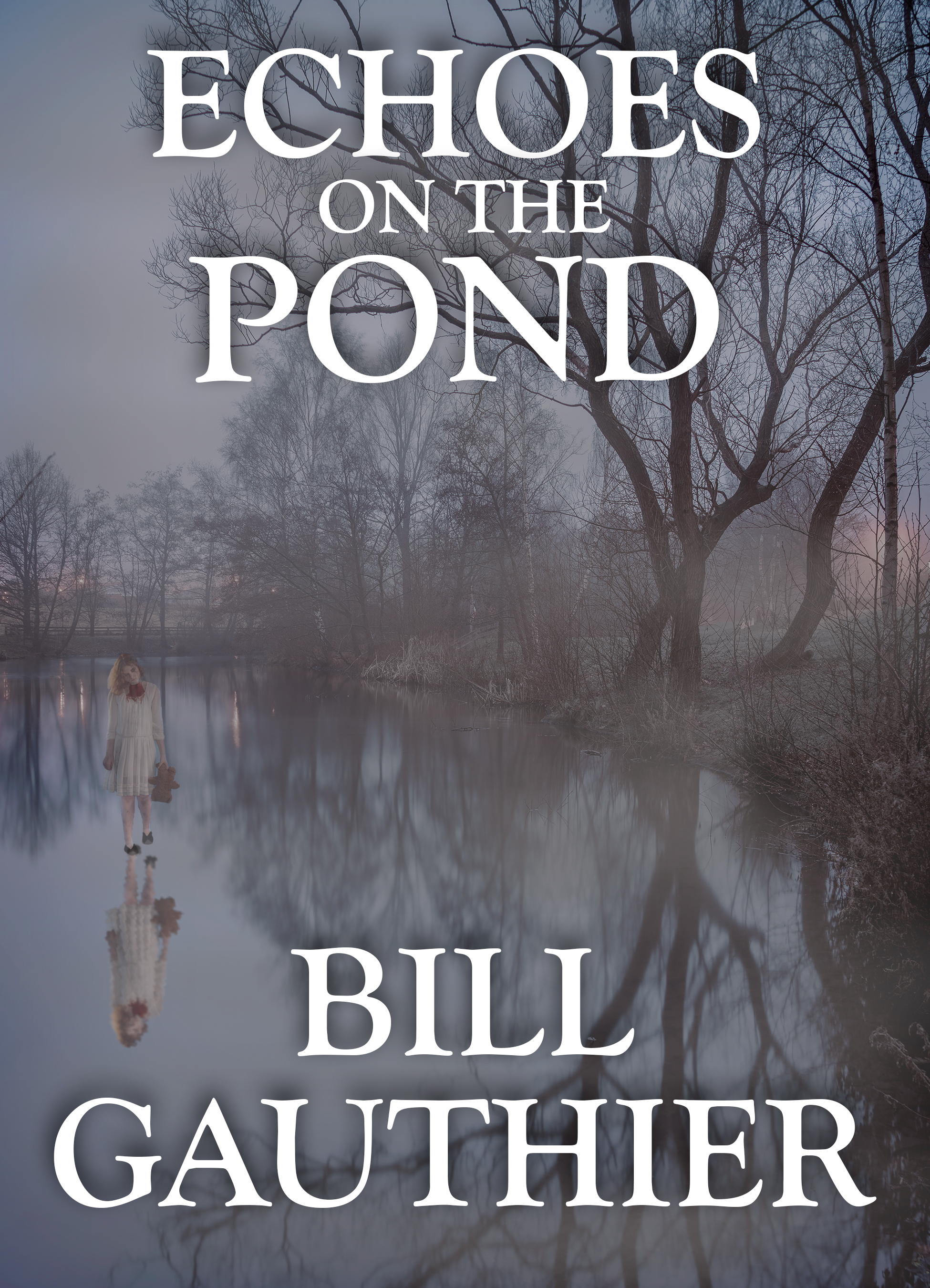
Grab Echoes on the Pond if you haven’t already. If you have bought it already, books make great gifts! And if you’ve read Echoes on the Pond, please consider reviewing on Amazon or Goodreads, and wherever else books are sold and reviewed.
You can also get my collection Catalysts or my novellas Alice on the Shelf and Shadowed.
Anyway, let’s do this!
***
I only got to page 176 in Project: Amusement Park this week. Last week I’d gotten to page 172. I’m writing about a character who is a correctional officer at a fictionalized version of a local jail. The character isn’t someone I particularly like but that’s not why I didn’t get too far into the work this week. It’s because something else dropped into my lap. Or, rather, my inbox.
David Dodd at Crossroad Press sent me the print proofs for the new edition of Alice on the Shelf Monday night so I spent this week going through them.
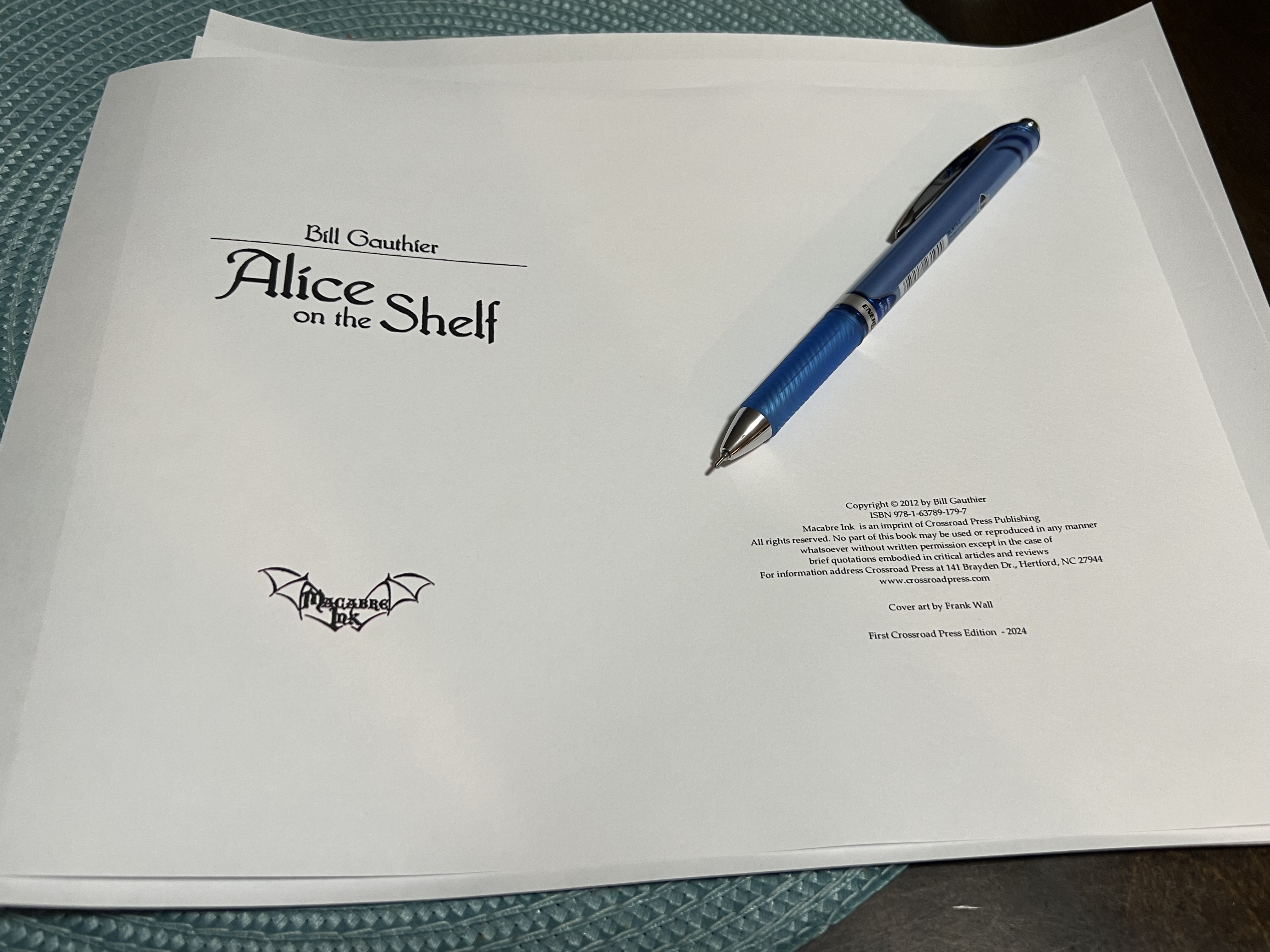
Most of the changes I’d like to see are cosmetic. The original print edition was a beautiful book and I want this to be as beautiful. Honestly, I want all my books to look nice. So I went through looking for typos or issues that we might’ve missed the first few times and also looking to see where we could use a fun font to help sell the story. After the reception Alice on the Shelf got at the Smithfield, Rhode Island, signing, I want to make sure a nice edition of Alice is out for people.
During the day yesterday, David Dodd and I went back-and-forth with the proofs and such and it seems to have come together. Now it’s being sent to David Wilson to be put into production.
Like Shadowed, I believe the only place to get Alice on the Shelf will be through Amazon. Unless I buy some and put them on consignment when I have events. Here is the cover for the new edition:
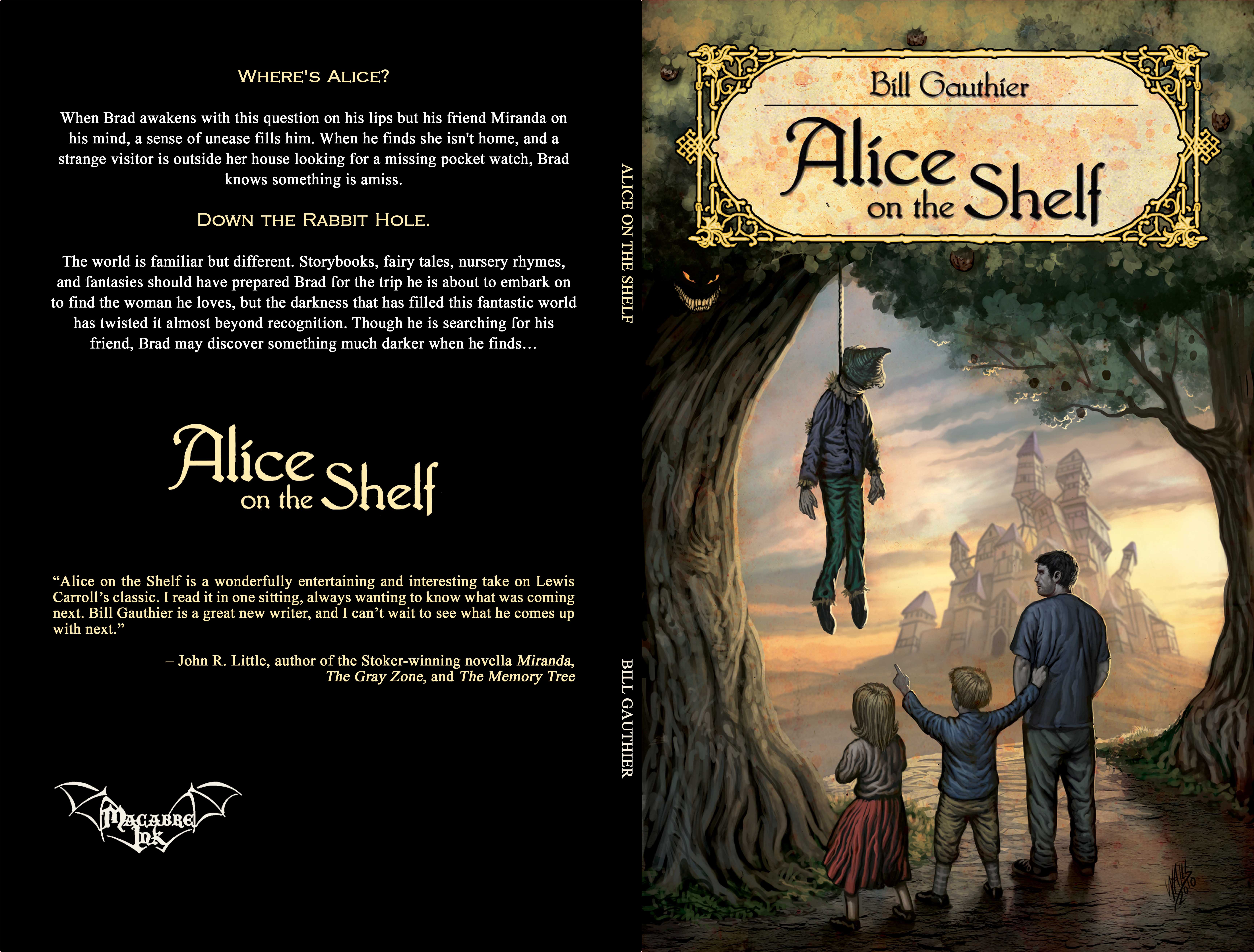
Considering the response I got to the book’s cover at the Smithfield event, we decided to keep Frank Walls’s art and keep the cover similar to the original edition. Why mess with a classic?
So, follow me down the rabbit hole (again), because Alice on the Shelf is coming (back) real soon to print. The eBook has also been updated.
***
Paid-subscribers on Patreon get an art/comic book update here. Become a Patron and see what’s in the works!
***
I mentioned above that I’d like all my books to look nice and thought I’d expound on that a little.
As a reader, I appreciate a text that looks nice. When different fonts are used to highlight different things, especially since it makes the story feel more real. It breaks up the monotony of blocks of text, too.
One of my gripes that I’ve had about some of the small press books I’ve seen in the past, especially ones that are print-on-demand, is that they feel very slap-dash. Please understand that I can’t call up any specific books (well, maybe one from a publisher no longer in business) but it’s one of those overall memories, if that makes sense? Like, I’ve seen it enough to know what I’m talking about but I can’t point any out. Wait! Not just small press books! I just remembered that some of the paperback lines were like this, too. The books were often very static in the way they looked. No bells and whistles because they were in the job of publishing words for money, not making an experience for the reader.
There is nothing wrong with bare bones publishing. A book should be able to stand on its own based on how the words read, not how they look. That said, I really do enjoy when I’m reading and suddenly there’s handwriting from a character, or a sign, or something else. You can see that in Echoes on the Pond where I not only do that with text, but there are two actual images in the book.
One is a “carving” made by a character. I drew that years ago and it looks rough because it’s supposed to. The other is a comic book page. Yeah, I put a full comic book page into the book (although it’s not the size of a full page…maybe someday in the future…). The comic page was something I drew out as a rough sketch and then asked my best friend, Toby Gray, to draw.
Toby is a helluvan artist and I thought I’d get some of his work into the book if I could. He drew it and sent it to me years before there was a publisher for the book. It tickles me that people can see his artwork in my novel.
The same goes with the covers. I’m a stickler about the covers. I actually made my own mock-up for Echoes on the Pond that I sent as inspiration to David Dodd at Crossroad Press.
My mock-up by me:
The actual cover by David Dodd:

There was a version in between that I didn’t care for as much as the cover we ended up with. We’ve gone back and forth with the covers for Catalysts and Shadowed as well.
Sometimes, as I send the list of notes like “pg 23 – Can we change Eat me. font to Blackadder?” or go through the back-and-forth with why this cover doesn’t work so well, and can we make sure that the thing moves there instead or there, and let’s make the paragraph on that page look like a drunken leper wrote it, I feel like an asshole. I feel like I’m being a pain in the ass.
But then I remember that I’m doing this to ensure the book looks good. That will make me look good and it will make the publisher look good. In the end, it seems like bells and whistles (and maybe it is) but it’s in service of the story and the reading experience.
***
NEXT SATURDAY!!! October 26th!!! 4pm!!!
Paul Tremblay, Greg F. Gifune, Maureen Boyle, Kathleen Brunelle, Christa Carmen, Derek Mola, and—somehow—me at the Barnes & Noble in Wareham, Massachusetts, as part of a Halloween Horror and True Crime event!
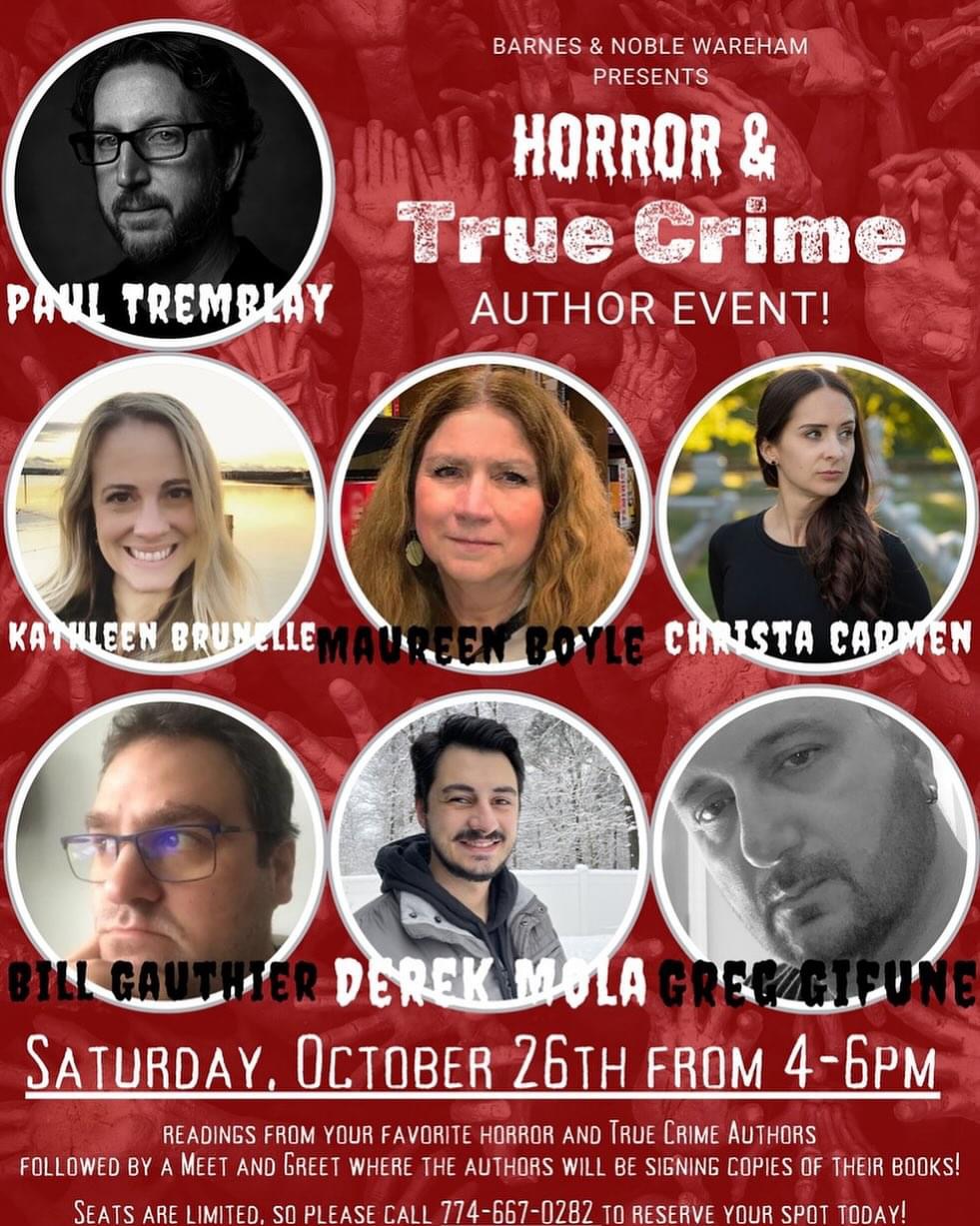
Space is limited so make sure to reserve a spot at 774-667-0282.
I’m really excited to be part of this ticket and hope you’ll come out and say hi!
***
I have said what I wanted to say. I think. Thank you for reading and for your support!
If you’d like to see what I could do if I wrote full-time, share this newsletter with others and consider a paid subscription.
You can also tip/donate on Ko-Fi.
Of course, you could also become a Patron on my Patreon, which has a lot more information about my works-in-progress and the books I’ll be querying, including titles and some simple, non-spoiler details.
Get my collection Catalysts, my novellas Alice on the Shelf and Shadowed, and definitely order Echoes on the Pond, out now!
If you haven’t left a review on Amazon, Goodreads, or anyplace else for Echoes on the Pond, please consider doing so. This greatly helps sell copies.
And maybe call your local brick-and-mortar bookstore and demand they carry it! I’ll even sign copies! Well, if they’re local to me. That means Massachusetts, Rhode Island, and maybe some of the other New England states.
Thank you for subscribing!

Leave a comment